
FIND THE RIGHT TONES THAT REFLECT YOUR STYLE
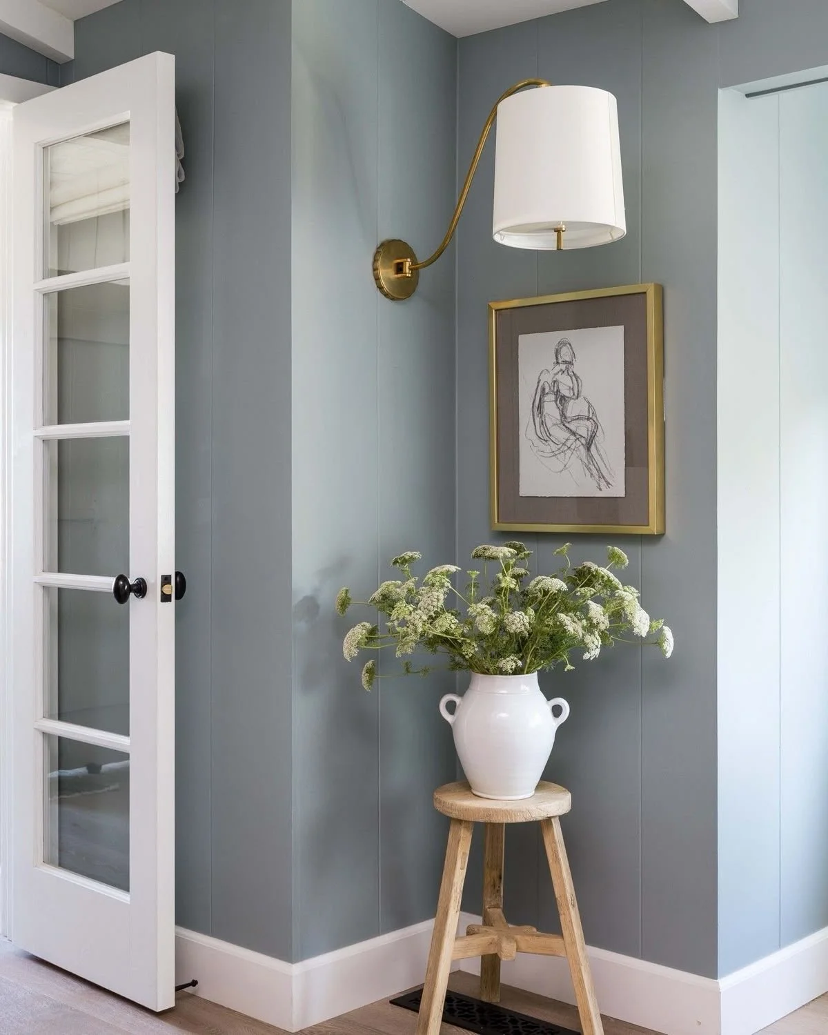
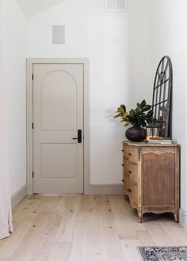
COLOR CONSULTATION
EXPERT COLOR CONSULTATION FOR HOMES AND OFFICES - FIND THE PERFECT PAINT COLORS
CREATE A MOOD OR THEME
Ensure your color selection complements the overall atmosphere and function of your space.
CONSIDER LIGHTING
Natural and artificial light in the space will affect the paint color, as lighting can make colors appear lighter, darker, or change their tone altogether.
Our Process
1. We Start With Your Space
We begin by discussing the look and feel you want to achieve, along with any existing finishes that need to be considered—such as brick, stone, flooring, countertops, cabinetry, furniture, or roofing.
2. We Narrow Down the Palette
Based on your preferences and the style of your home, we help guide you toward colors that complement your space. This may include primary wall or siding colors, trim, doors, shutters, cabinetry, and other accent areas.
3. We Create Digital Color Mockups
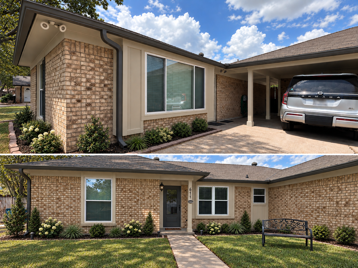
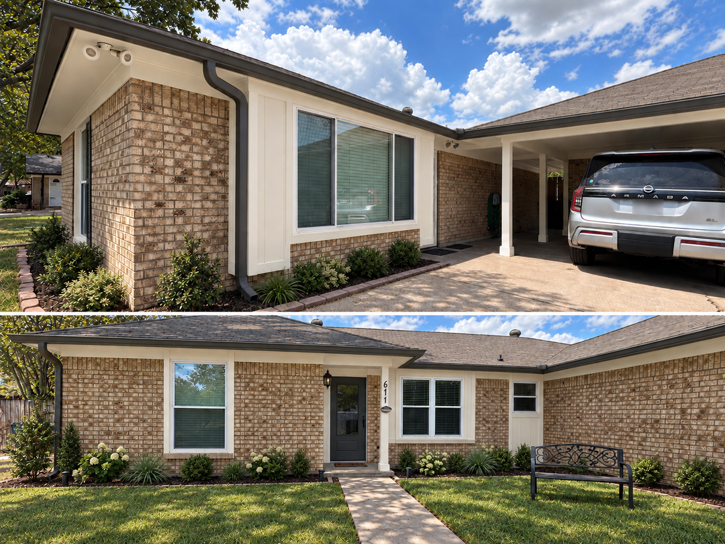
When helpful, we use AI-assisted visualization technology to apply proposed colors to photos of your actual home. This gives you the opportunity to compare different palettes and get a better sense of how each option may transform the finished space.
4. We Refine the Details
After reviewing the mockups, we can adjust individual colors, change accent selections, or explore additional combinations until we arrive at a direction you love.
5. We Confirm With Physical Samples
Digital renderings are a visualization tool and cannot perfectly replicate how paint will appear in real-world lighting. Before finalizing your project, we recommend reviewing physical paint samples in the actual space and at different times of day.
The Goal: Modern, Bright & Visually Larger
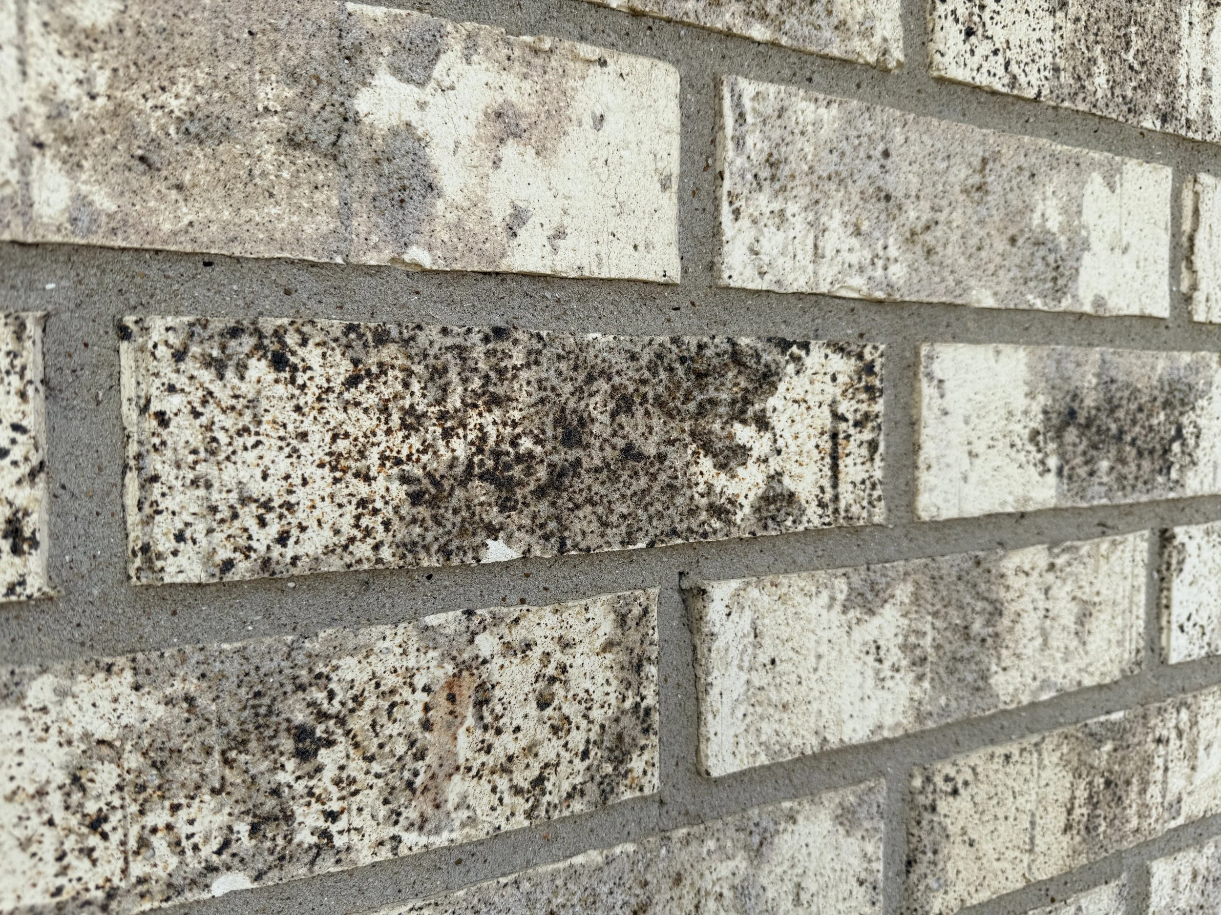
Our homeowners came to us wanting to give their exterior a more modern, updated feel while making the home appear larger and more open. Because the existing brick was staying, our color selections focused on complementing its natural tones while using lighter, cohesive finishes to visually expand the home. Strategic darker accents added contrast and definition without overwhelming the exterior—creating a fresh, modern look that feels brighter, cleaner, and more intentional.
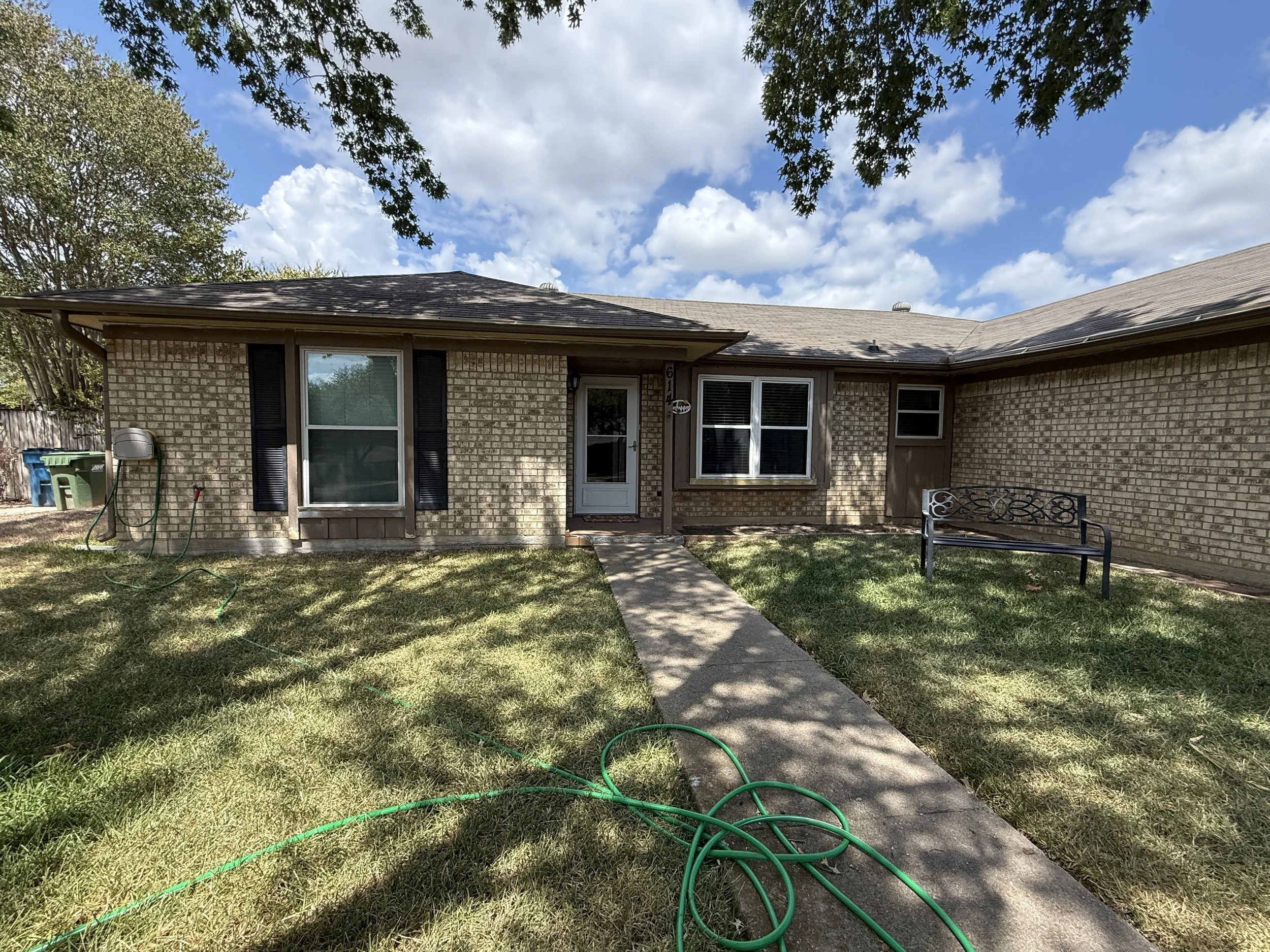
BEFORE
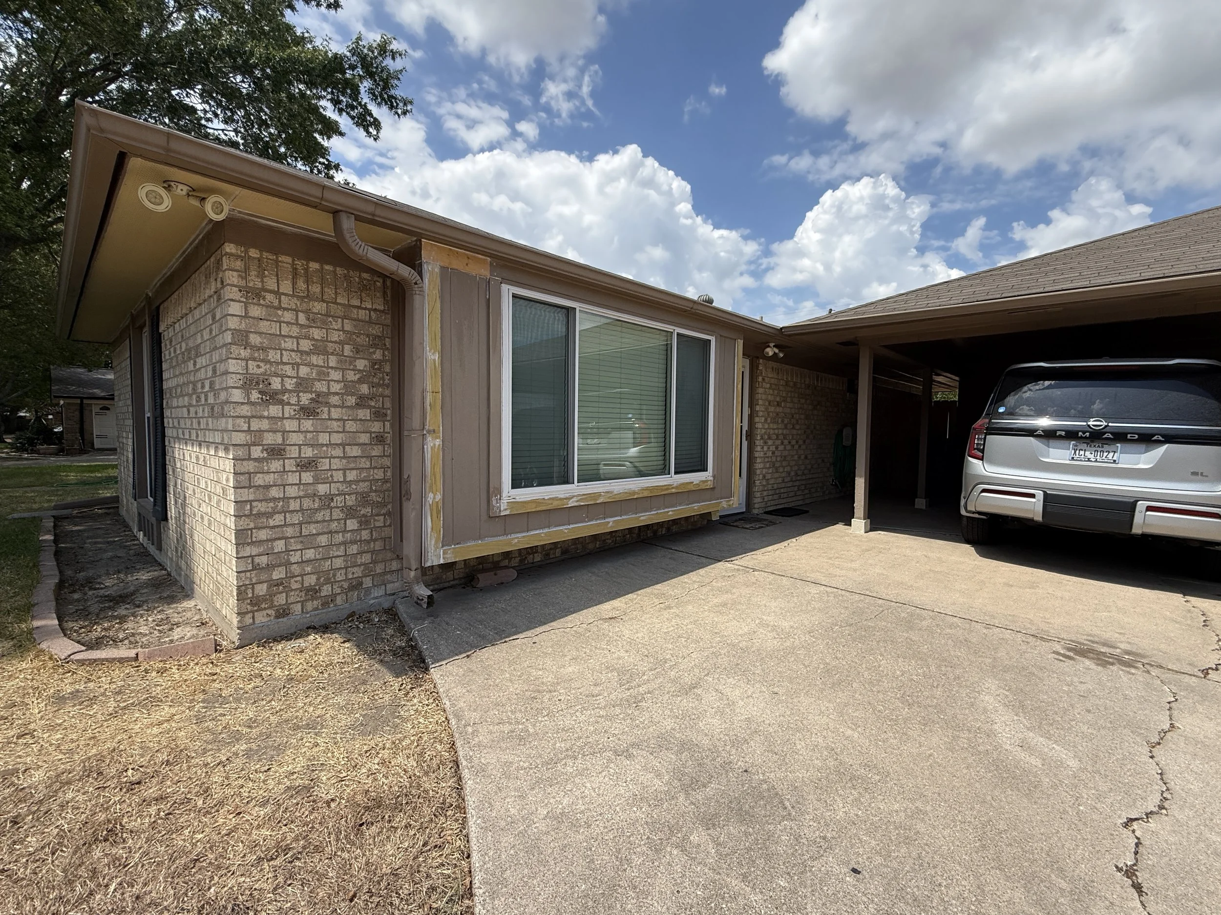
VISUALIZATION
COLORS OF THE YEAR
-
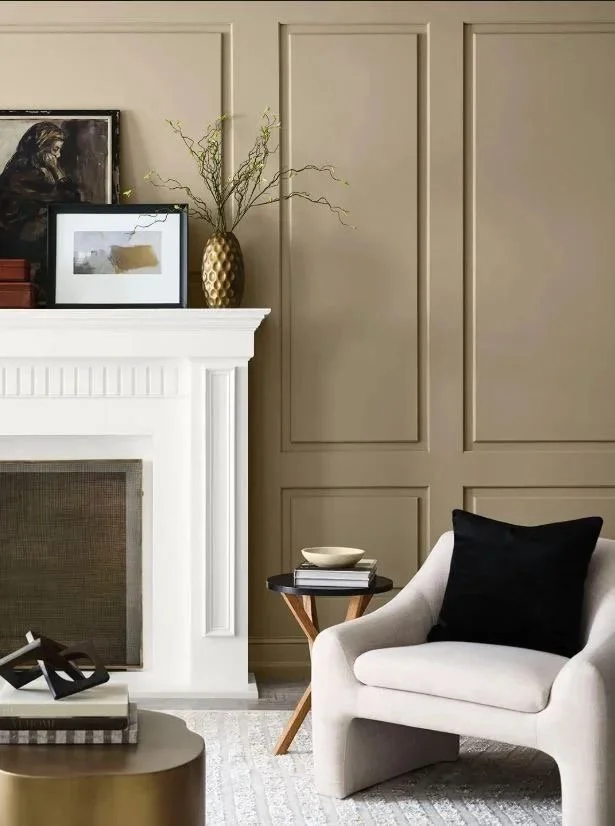
2026 - Universal Khaki SW 6150
An earthy, mid-tone warm neutral with a slight yellow undertone.
-
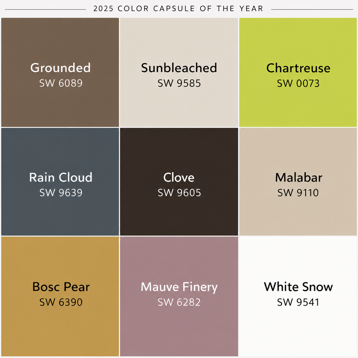
Color Capsule
Grounded SW 6089: A rich, calming, and versatile brown. Sunbleached SW 9585: A light neutral deeper than white. Chartreuse SW 0073: A bright and eclectic yellow-green. Rain Cloud SW 9639: A deep, stormy gray-blue. Clove SW 9605: A near-black, deep brown. Malabar SW 9110: A soft, sandy beige neutral. Bosc Pear SW 6390: A warm golden yellow with earthy tones. Mauve Finery SW 6282: A sophisticated dusty mauve. White Snow SW 9541: A soft and clean white.
-
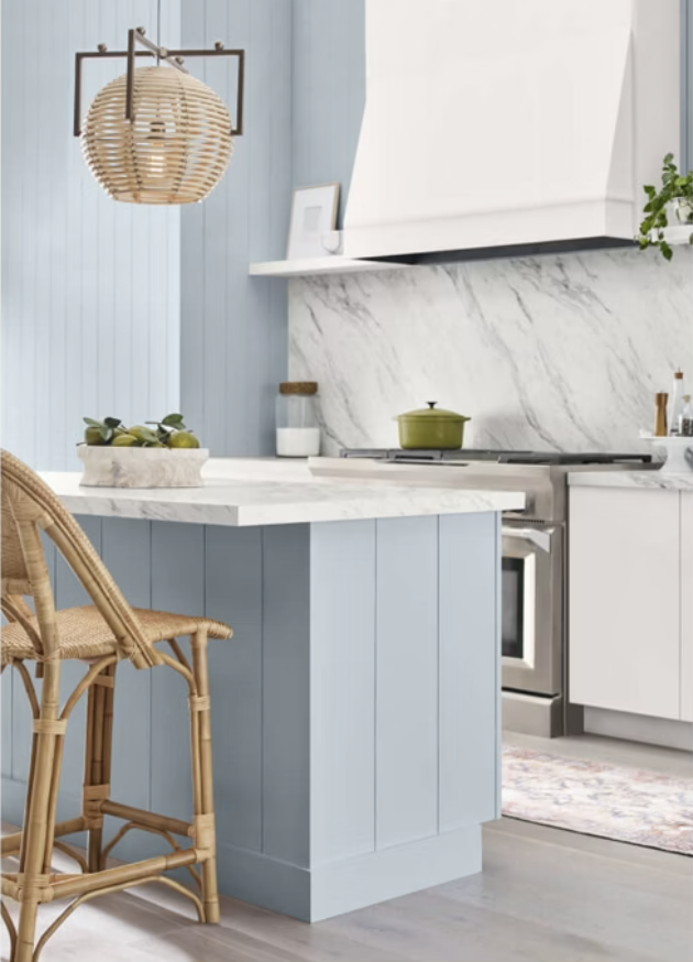
2024 - Upward SW 6239
A serene, uplifting shade of blue. It’s the color that emerges when we pause, breathe deeply, and let our thoughts settle.
-

2023 - Redend Point SW 9081
Invite a sense of connection to the world around you with this subtle yet soulful hue.
-

2022 - Evergreen Fog SW 9130
This effortlessly elegant color brings a soft, organic touch to any space, offering a subtle yet striking statement.
-

2021 - Urbane Bronze SW 7048
Rooted in nature’s purest elements—stone, metal, and wood—this grounded hue evokes a sense of calm, balance, and serenity.
“The essence of interior design will always be about people and how they live.”
Albert Hadley